HERBULES 海博力斯
品牌|海博力斯 HERBULES
品牌包裝整合設計|軌室 Absence Lab
「HERBULES 海博力斯」結合大海與希臘神話之象徵,以草本的形式在台灣誕生,品牌定位聚焦於「針對現代青壯年族群,打造一個提升生活品質、找到自信的男性保健品牌」。
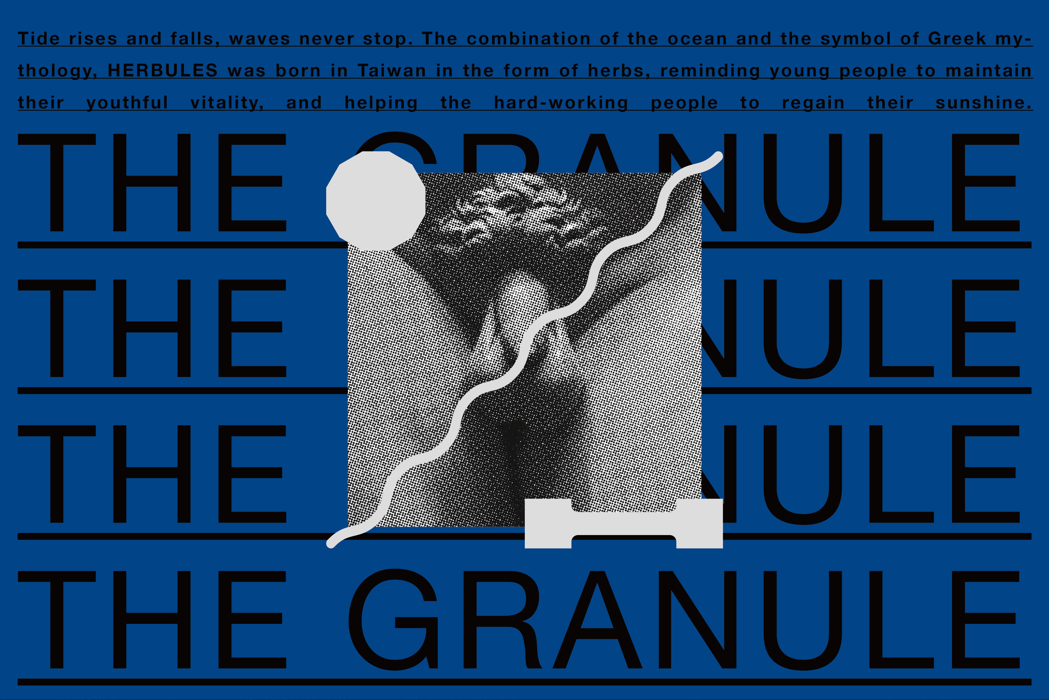
Inspired by the sea and Greek mythology, “HERBULES” is a modern wellness brand for men, The brand’s identity design focuses on a combination of strength and beauty.
品牌概念與設計說明:
❶ 力與美的結合
為了打造屬於現代的男性保健食品形象,從品牌命名、核心精神、識別規劃至包裝設計,皆注入了優雅的元素,如神話、自然意象與經典色彩,目的是為了平衡品牌個性,並與市場做出差異,提升客群對於品牌的好感度與記憶度。
❷ 讓你更有自信
優雅美觀的識別與包裝,不僅能體現品牌個性,更能讓消費者購買後,不用再為了「被人看到會不好意思的包裝」而刻意把產品藏起來,反而是能更有自信的使用保健食品,或當作禮盒也十分合宜。
❸ 又硬又挺又時尚
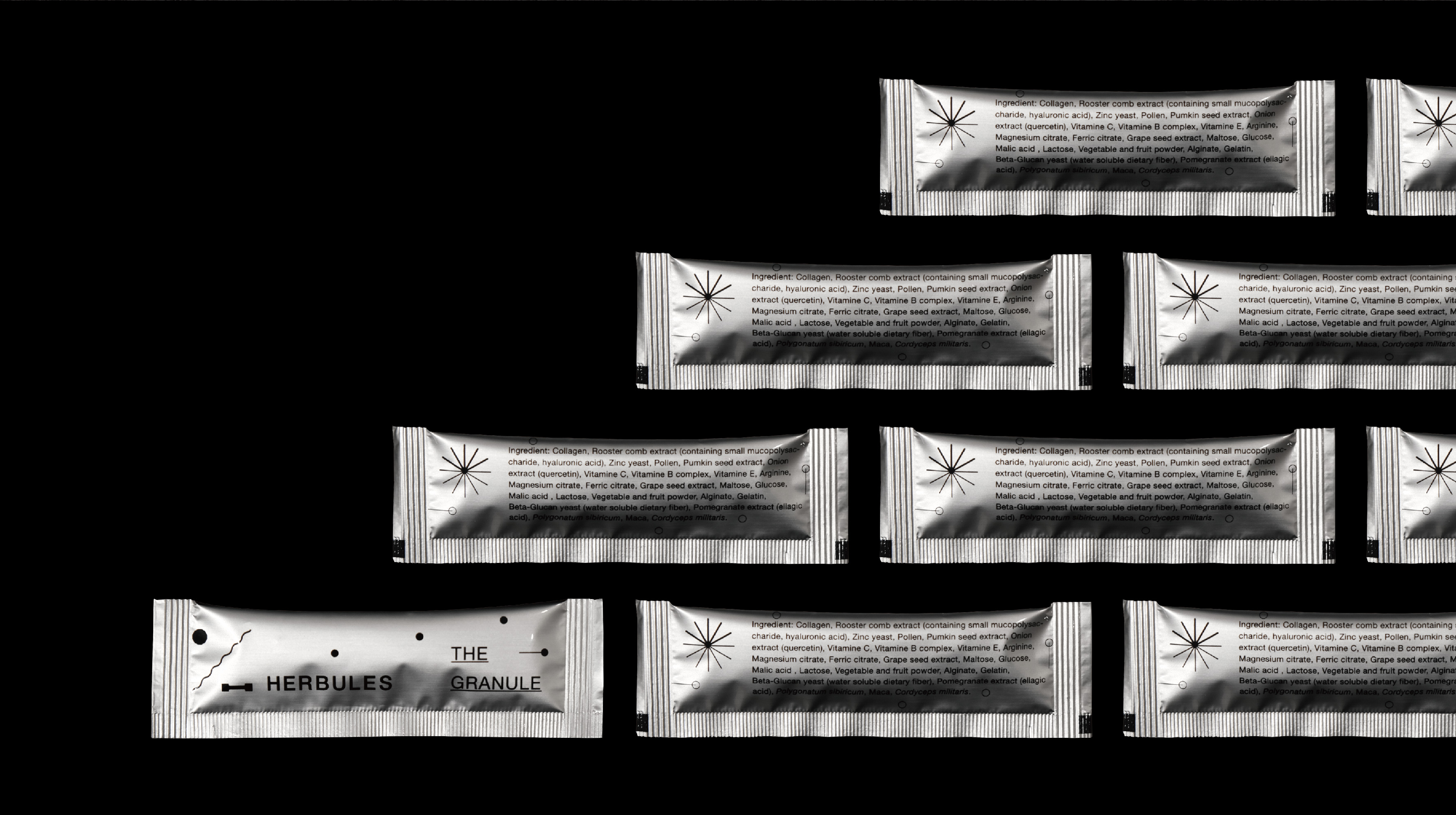
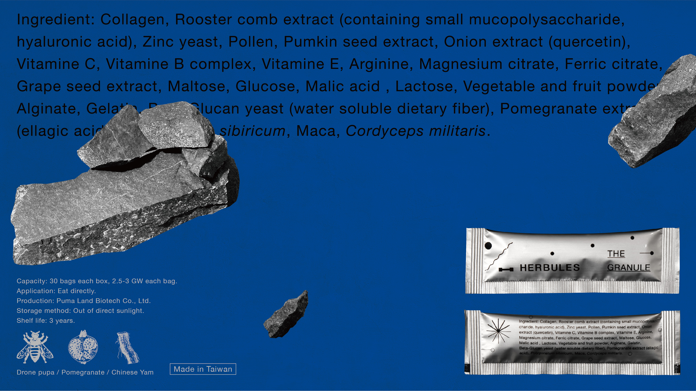
包裝設計使用高磅數的奇艷象牙卡,使盒型更為硬挺,印上特色藍與特色銀,呈現出「陽剛與時尚並具」的意象。群聚於包裝右側的圓點符號,除了代表內容物的顆粒狀,也象徵著充滿活力的精子。我們期待透過視覺的轉譯,間接傳遞現代人對於美好生活的期待與想像。
The dumbbell symbol, which stands for exercising, comes from the brand’s initial – the letter “H.” Geometric abstraction form of “sun and waves” symbolizes masculine vitality and regular healthy life, presenting the brand spirit of “HERBULES. The geometric abstraction style continues in the packaging design. The circular symbol subtly implies the vibrant sperm, which also represents that the content is in the form of granules. In terms of colors, Pantone’s blue and grey shades are used to create a “masculine and stylish” vibe.
Inspired by the sea and Greek mythology, “HERBULES” is a modern wellness brand for men, The brand’s identity design focuses on a combination of strength and beauty.
品牌概念與設計說明:
❶ 力與美的結合
為了打造屬於現代的男性保健食品形象,從品牌命名、核心精神、識別規劃至包裝設計,皆注入了優雅的元素,如神話、自然意象與經典色彩,目的是為了平衡品牌個性,並與市場做出差異,提升客群對於品牌的好感度與記憶度。
❷ 讓你更有自信
優雅美觀的識別與包裝,不僅能體現品牌個性,更能讓消費者購買後,不用再為了「被人看到會不好意思的包裝」而刻意把產品藏起來,反而是能更有自信的使用保健食品,或當作禮盒也十分合宜。
❸ 又硬又挺又時尚
包裝設計使用高磅數的奇艷象牙卡,使盒型更為硬挺,印上特色藍與特色銀,呈現出「陽剛與時尚並具」的意象。群聚於包裝右側的圓點符號,除了代表內容物的顆粒狀,也象徵著充滿活力的精子。我們期待透過視覺的轉譯,間接傳遞現代人對於美好生活的期待與想像。
The dumbbell symbol, which stands for exercising, comes from the brand’s initial – the letter “H.” Geometric abstraction form of “sun and waves” symbolizes masculine vitality and regular healthy life, presenting the brand spirit of “HERBULES. The geometric abstraction style continues in the packaging design. The circular symbol subtly implies the vibrant sperm, which also represents that the content is in the form of granules. In terms of colors, Pantone’s blue and grey shades are used to create a “masculine and stylish” vibe.